The Neubad Plakat
A Contemporary Design Phenomenon
Herausgegeben von Erich Brechbühl, Fons Hickmann, Lea Hinrichs, Sam Steiner und Sven Lindhorst-Emme

Herausgegeben von Erich Brechbühl, Fons Hickmann, Lea Hinrichs, Sam Steiner und Sven Lindhorst-Emme
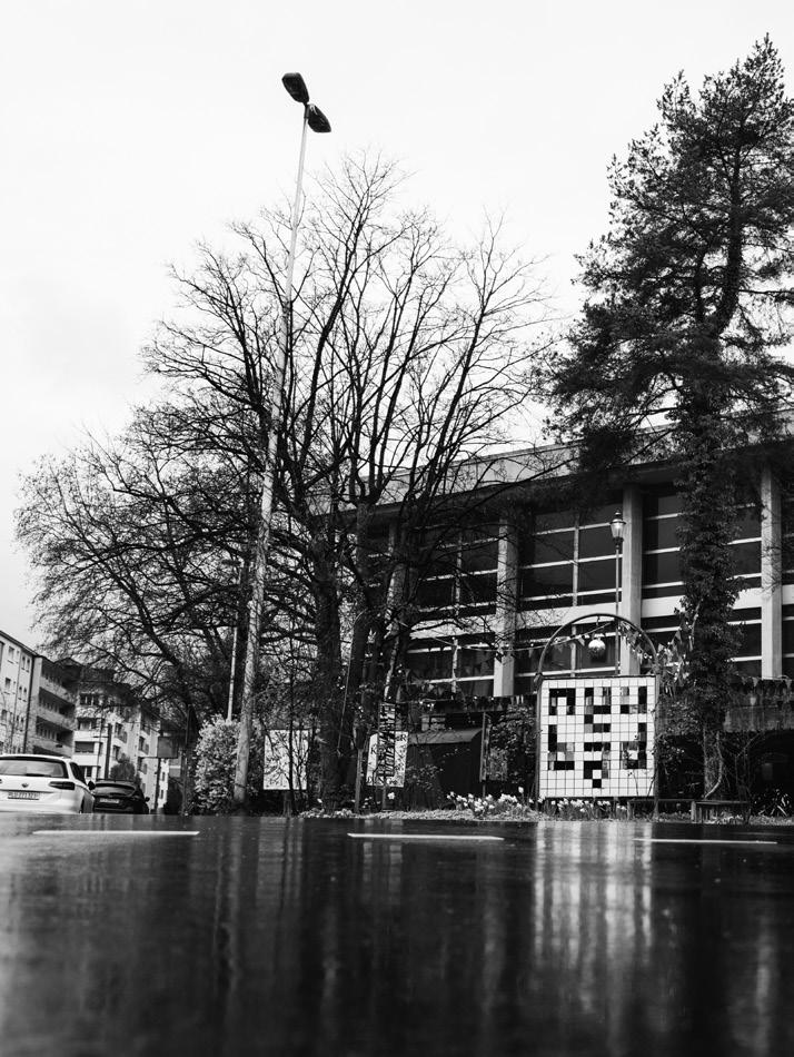
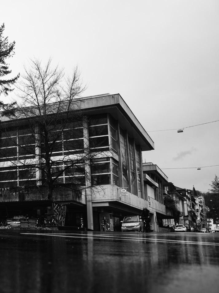
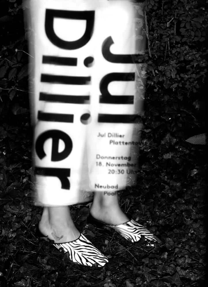
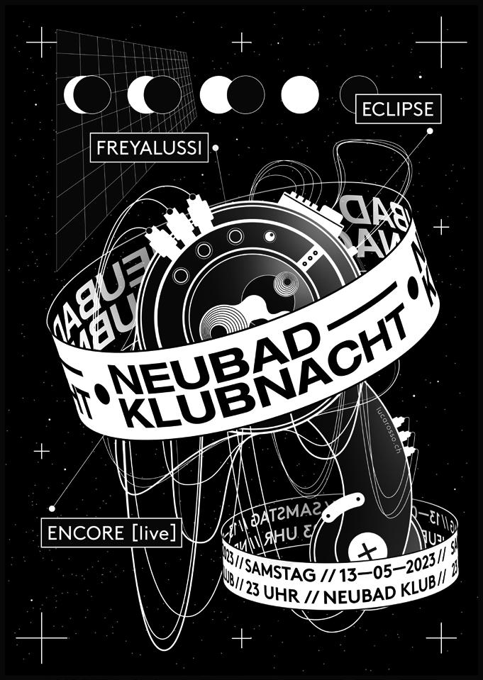
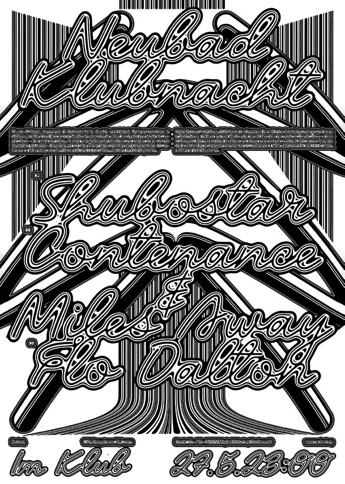
am Fuße malerischer Berge, an einem ruhigen See, hat sich ein Biotop avantgardistischer Gestaltung gebildet. Das selbst ernannte Poster Town Luzern hat es geschafft, die Grenzen zwischen Kunst und Design zu verschmelzen und dabei ein zeitgenössisches Design-Phänomen zu kreieren. Die Rede ist von den Plakaten für das Kulturzentrum Neubad Luzern, die längst den Weg aus dem Tal heraus in alle Welt gefunden haben.
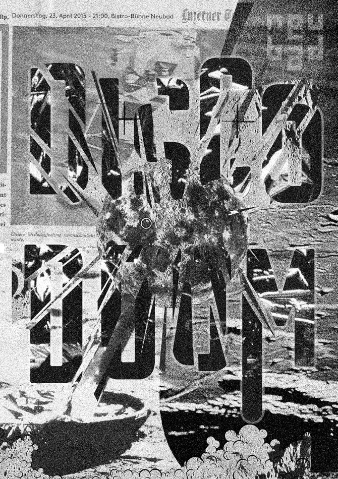
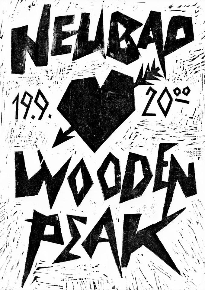
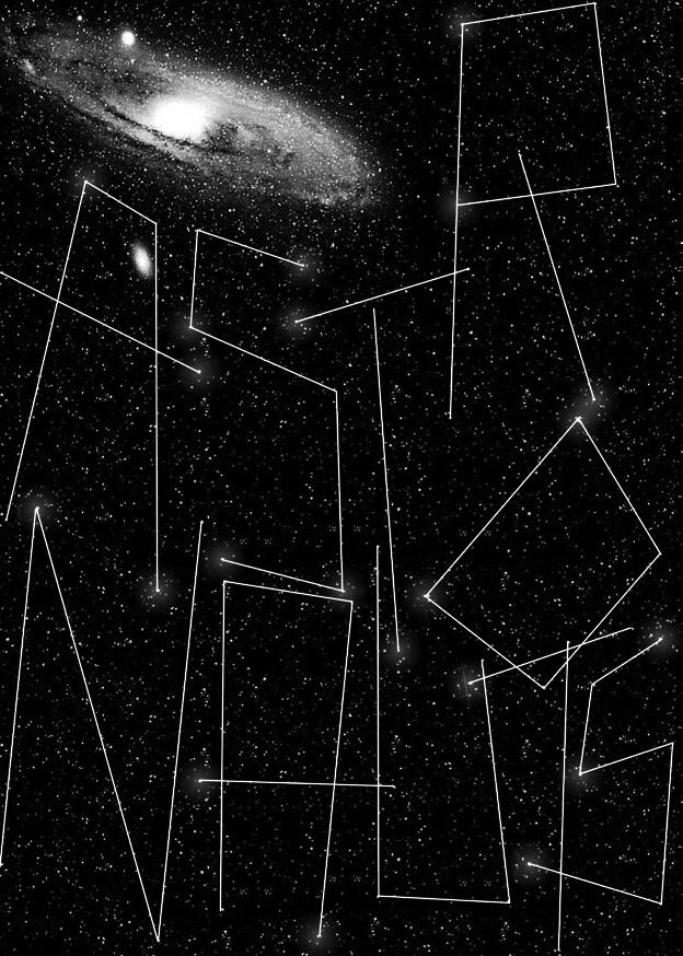
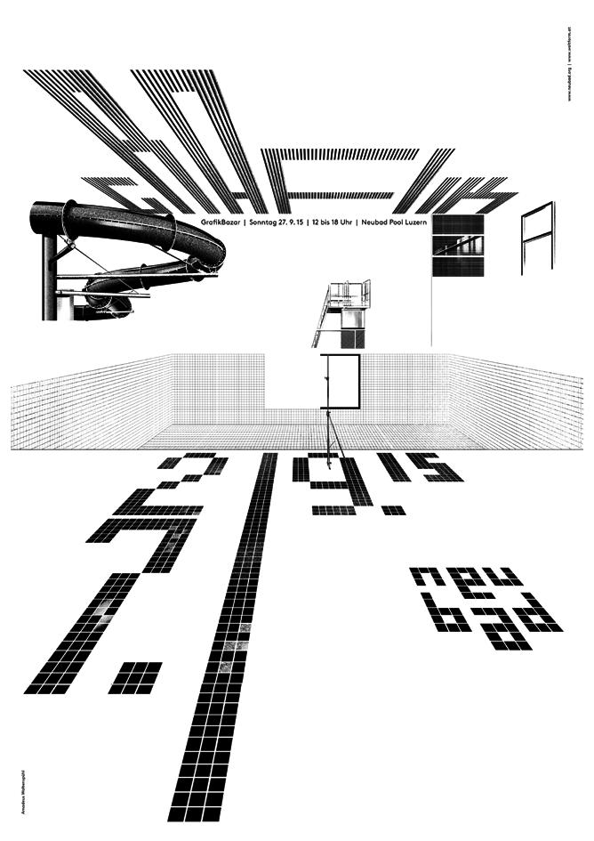
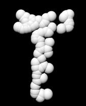
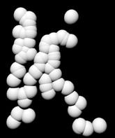
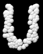
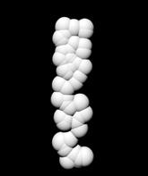
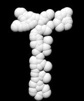
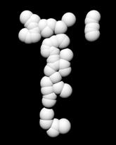
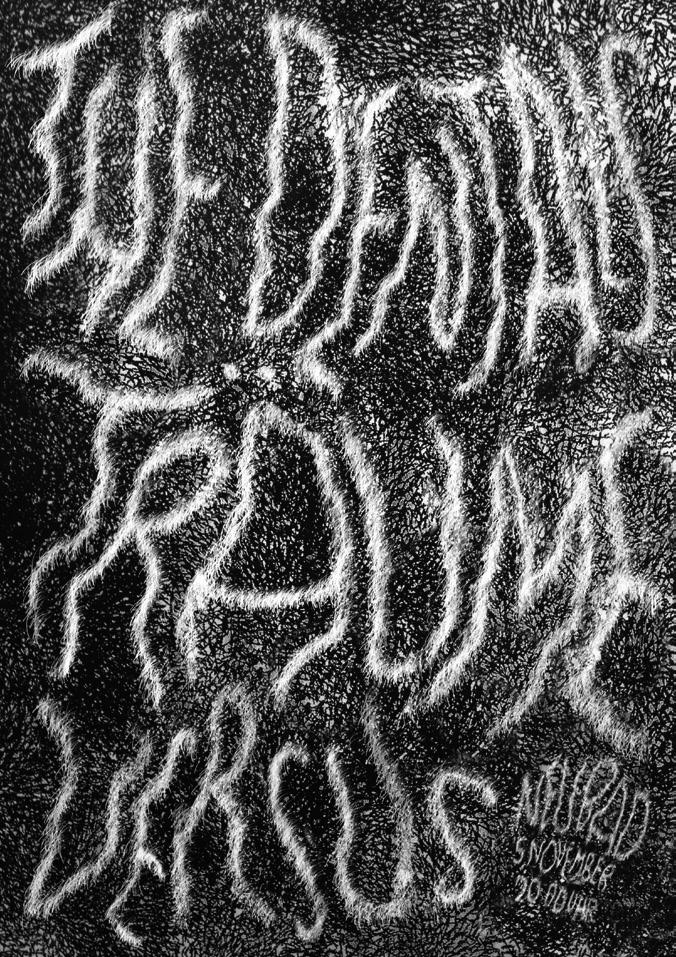
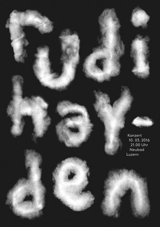
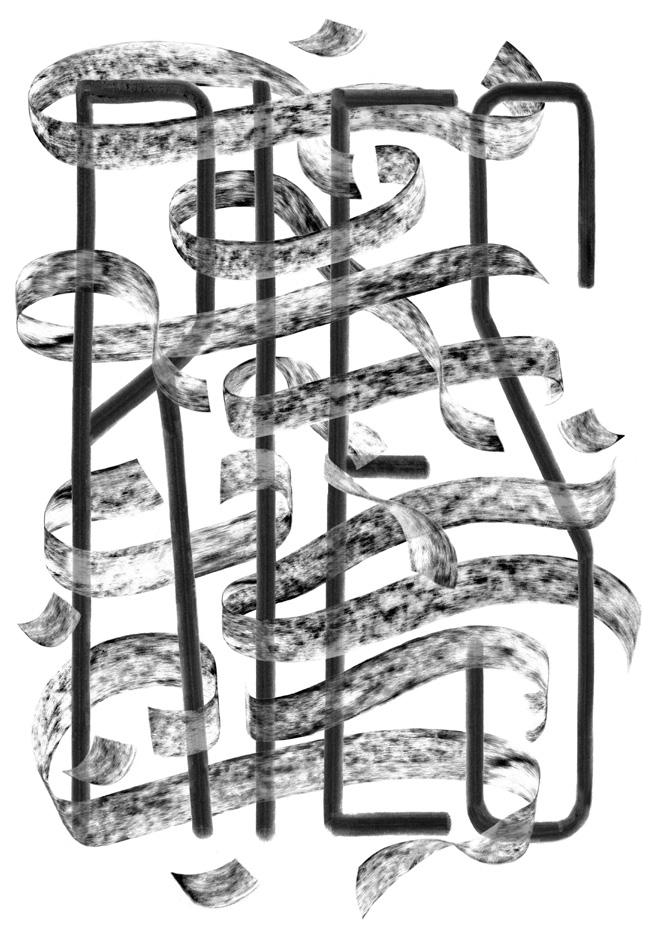
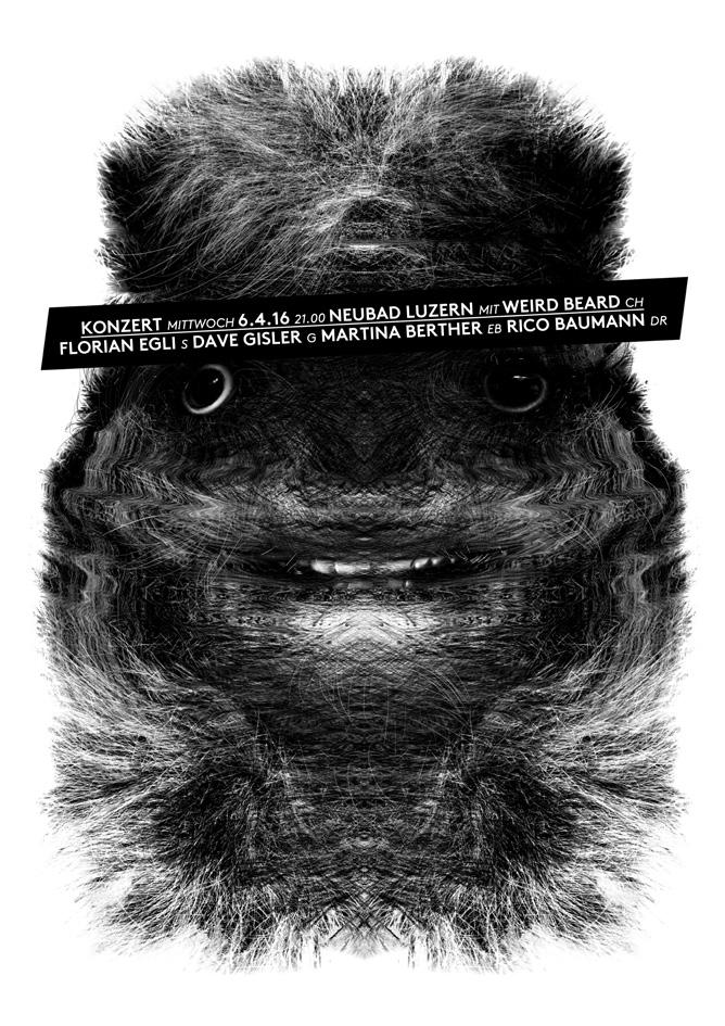
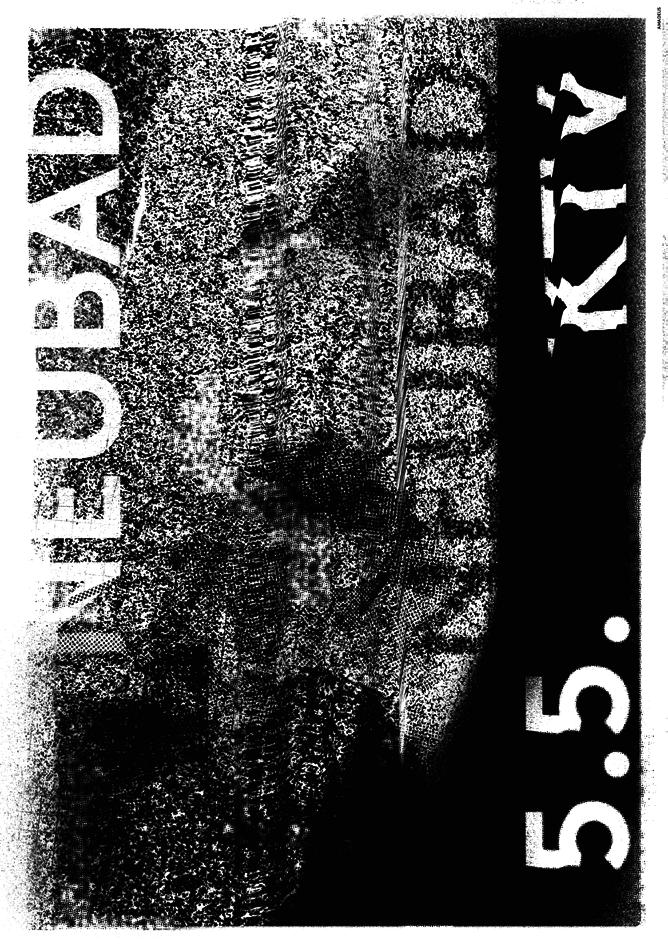
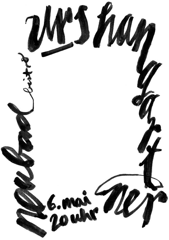
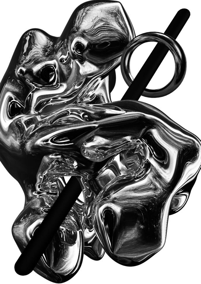
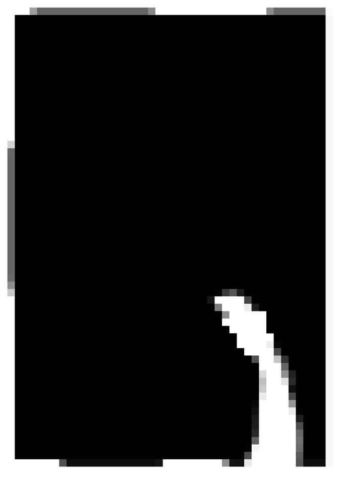
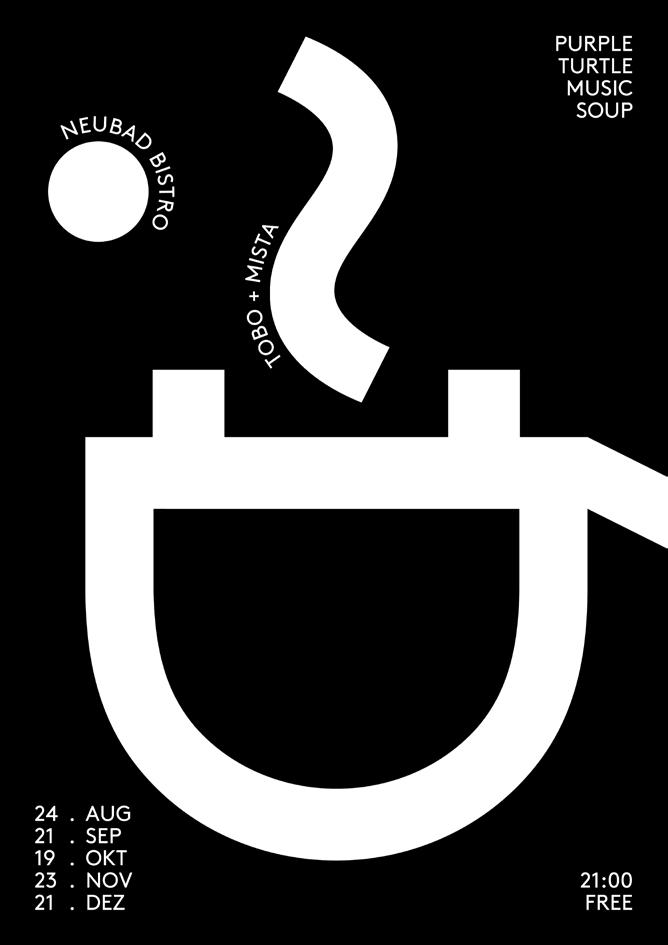
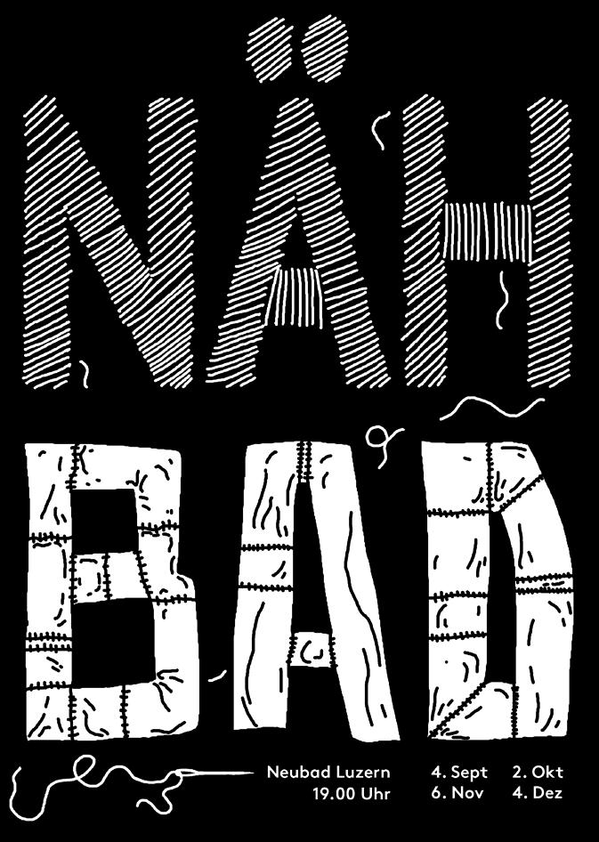
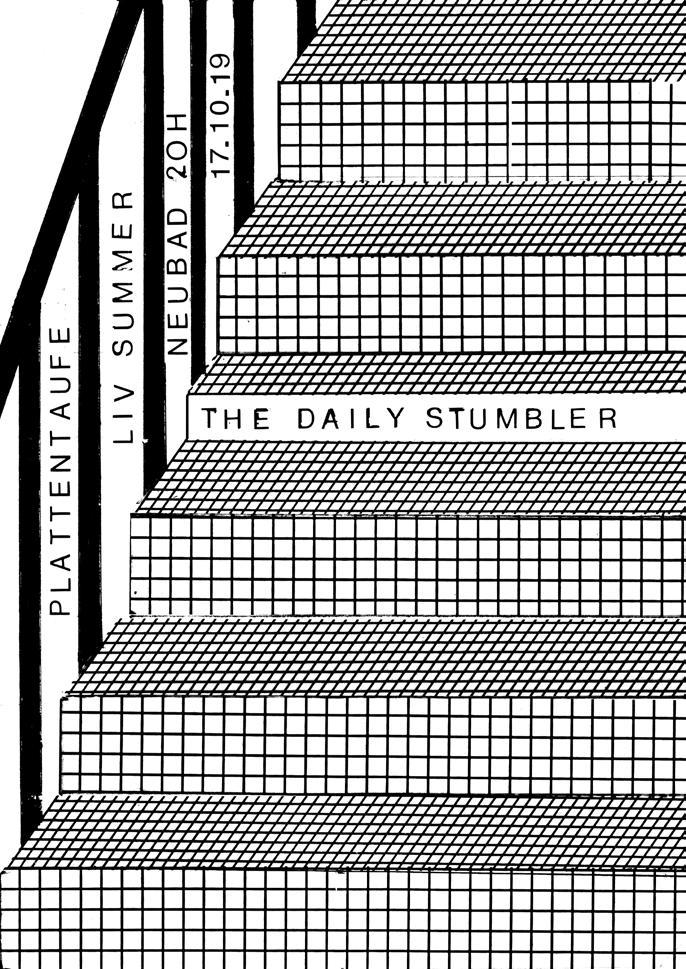
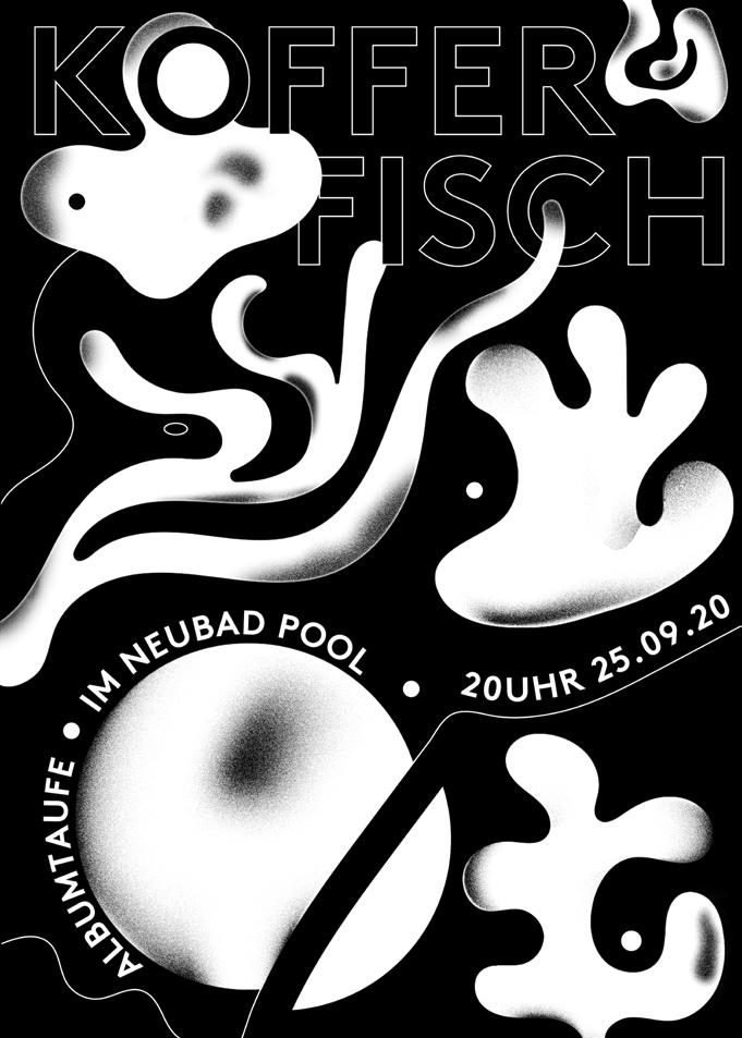
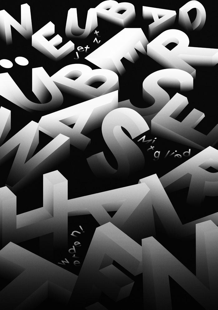
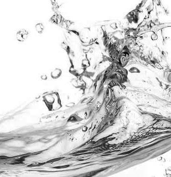
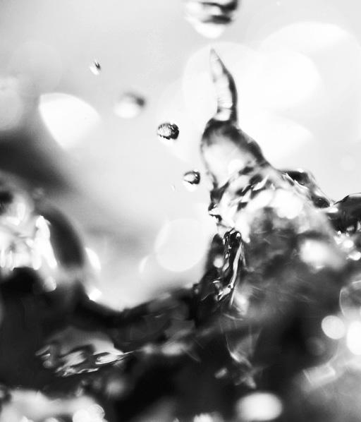
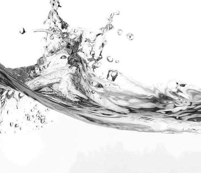
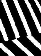
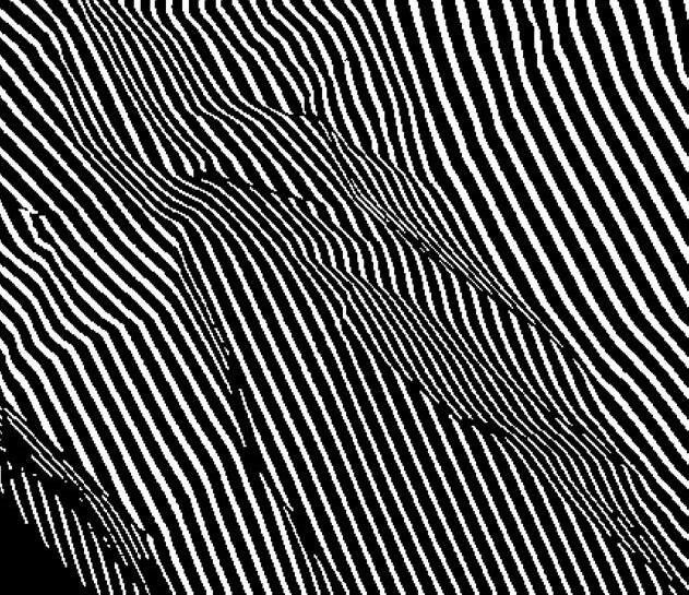
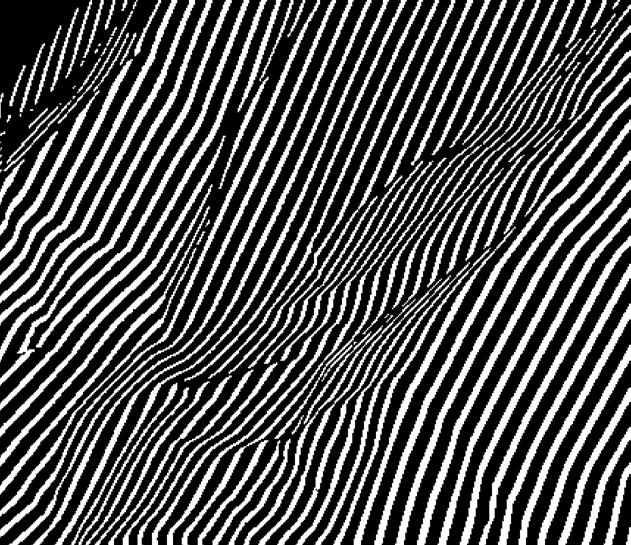
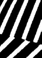
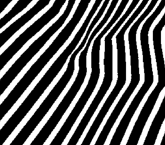
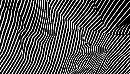
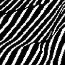
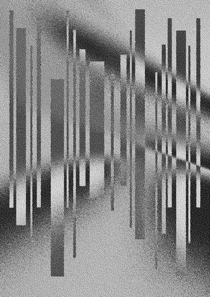
Die Plakate, die in minimalistischem Schwarz-Weiß gehalten sind, setzen nicht nur gegenwärtige Designtrends, sondern überschreiten spielerisch die Grenzen unserer Wahrnehmungsgewohnheiten. Durch progressive Illustration und experimentelle Typografie entstehen subkulturelle Codes auf hochkulturellem Niveau, die trotz ihrer künstlerischen Gewagtheit unprätentiös bleiben.
In the Swiss backwoods, at the foot of picturesque mountains, by a tranquil lake, a biotope of avantgarde design has formed. The self-proclaimed Poster Town Lucerne has managed to break down the boundaries between art and design, creating a contemporary design phenomenon in the process. We’re talking about the posters for the Neubad Luzern cultural center, which have long since found their way out of the valley and into the world. The posters, designed in minimalist black and white, are not just setting current design trends, but playfully transgress the boundaries of our perceptual habits. Progressive illustration and experimental typography create subcultural codes on a highly cultural level which, despite their artistic daring, remain unpretentious.
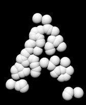
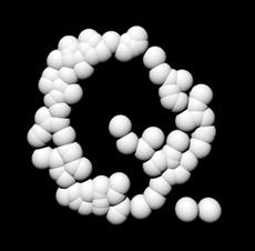
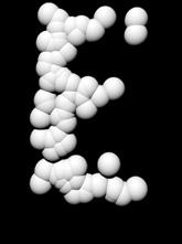
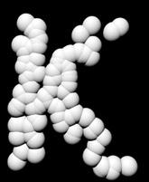
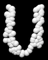
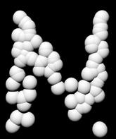
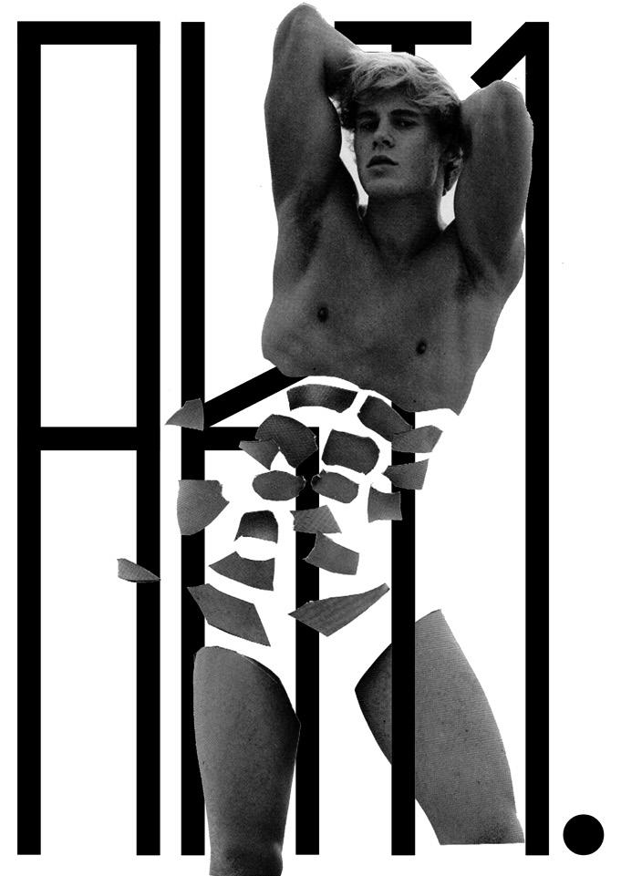
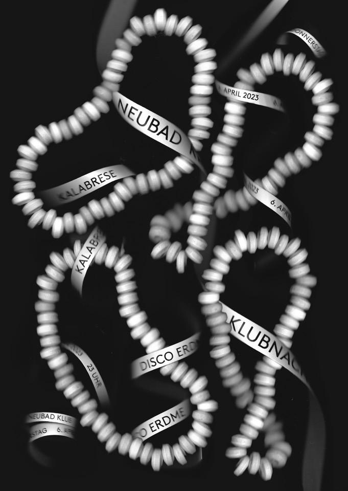
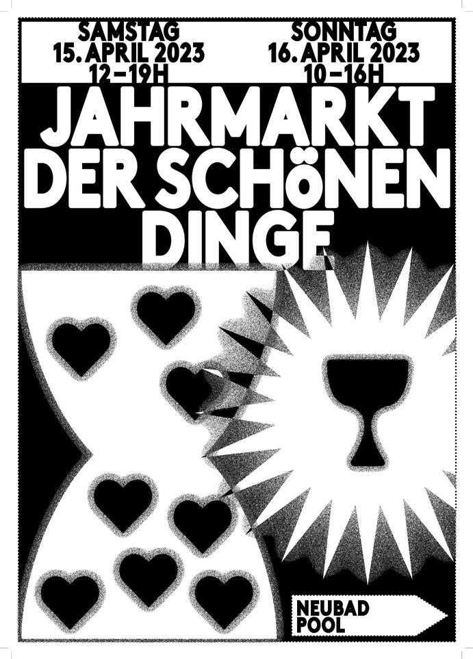
des Schweizer Plakats, sind aber international konnotiert, da die Gestalter:innen aus ganz Europa kommen. Das Design der Neubad Plakate wagt sich einen Schritt weiter und bricht mit den Archetypen traditioneller Vorgänger. Der Verzicht auf Farbe und die experimentelle Typografie, die auch die Grenzen der Lesbarkeit touchiert, sind Merkmale, die auch in der Jugend- und Szenekultur zu finden sind. Dabei entsteht eine Synthese aus verschiedenen Stilen und Strömungen, die dem »Neubad Plakat« eine sehr eigene Ausstrahlung verleiht. Das »Neubad Plakat« ist nicht nur Ausdruck zeitgenössischen Designs, sondern auch ein Statement gegen die optische Überflutung durch buntes Spektakel der Werbung und gegen die überreizende visuelle Verschmutzung der
Neubad prints belong to the tradition of the Swiss poster, but have an international connotation, as their designers come from all over Europe. The design of the Neubad posters ventures a step further and breaks with the archetypes of traditional predecessors. The renunciation of color and the experimental typography, which also touches the boundaries of legibility, are characteristics that can also be found in youth and scene culture. The result is a synthesis of different styles and currents, which gives the “Neubad Plakat” its very own charisma.
The “Neubad Poster” is not only an expression of contemporary design, but also a statement against the visual overload of colorful spectacle of advertising and against the overstimulating
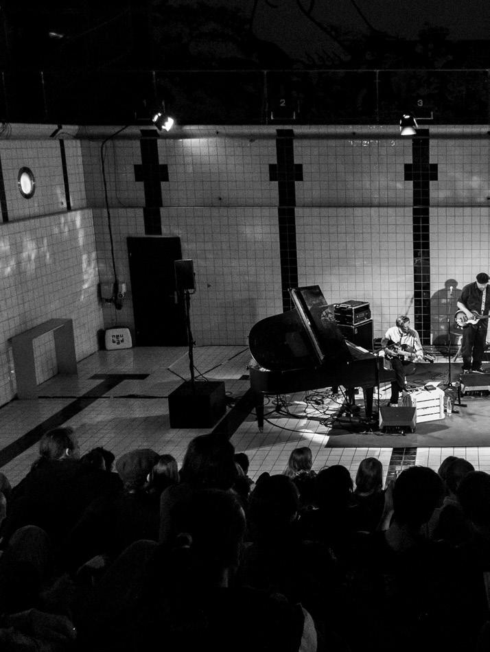
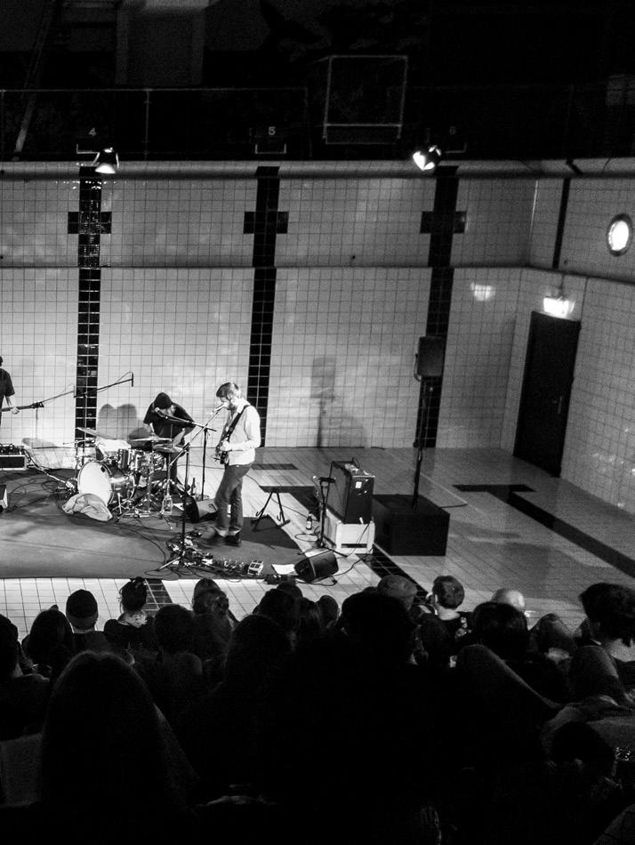
Immer wieder tauche ich ein in den Grafik-Pool. Ich streife mir die schwarzweiße Brille über. Gedanken zur Farbwahl schenke ich mir. Auch die zu verwendende Schrift ist seit Jahr und Tag die gleiche. Soviel ist klar. Das sind die Vorgaben. Beim Rest tobe ich mich aus. Als wäre ich Teil eines großen gestalterischen Forschungsprojekts, suche ich weiter nach Möglichkeiten. Ich bin Schwimmerin, tauche nach Ausdrucksweisen, hole Luft, während die nächste ins Becken springt. Ich schaue den anderen zu, betrachte ihre Bewegungen und lerne. In Teamarbeit bewältigen wir die Flut an Veranstaltungen, die alle im gleichen Kosmos stattfinden und kommuniziert werden wollen. Der Lustfaktor, ein Teil dieses Projekts zu sein, ist groß. Alle paar Wochen werden die Aufträge unter immer mehr Gestalter:innen verteilt. First come, first served. Als der Grafik-Pool noch eine Badewanne war, funktionierte das so: Ich floatete relativ planlos durchs Neubad, traf in irgendeiner Zwischenetage auf den damaligen Veranstalter
Time and again I dive into the graphic pool. I slide on my black and white glasses. I don’t think about color-choice. Even the typeface I use has been the same for years. This much is clear. These are the guidelines. As for the rest, I let myself go wild. I keep looking for possibilities as if I were part of a large design research project. I’m a swimmer, diving for expressions, catching my breath as the next one jumps into the pool. I watch the others, contemplate their movements, and learn. Working as a team, we manage the flood of events that all take place in the same cosmos and want to be communicated. The fun factor of being a part of this project is enormous. Commissions are distributed among an increasing number of designers every few weeks. First come, first served. When the graphic pool was still a bathtub, it worked like this: I floated relatively haphazardly through the Neubad, met the then organizer Urs Emmenegger on a mezzanine
Max Küng für eine Lesung im Neubad zugesagt habe und es dafür noch ein Plakat brauche. Fix. Gerne. Das war mein Erstes → 27. Als Lohn durfte ich meine Kopierkarte aufladen. Fürs Nächste gab es ein Mittagessen. Heute werden die Gutscheine fein säuberlich per Post nach Hause geschickt. Nice. Aber so richtig wichtig war das Honorar bei diesem Job noch nie.
Wir wollen gestalten. Ausprobieren. Mitentwickeln. Dabei sein und forschen. Entstanden ist eine visuelle Sprache, die vielfältiger nicht sein könnte und dennoch unverkennbar geworden ist. Entwickelt aus individuellen Herangehensweisen, aus tausenden Entscheidungen, aus Lust, Widerspruch und aus einer unendlichen Zahl an sich immer wieder wandelnden Perspektiven der Gestaltenden. Im Divers-Sein verstehen wir uns. Und wenn die Plakate dann nebeneinander an den Säulen vor dem Eingang des Neubads hängen, sehe ich: auch die Plakate verstehen einander.
floor, who told me that Max Küng had just confirmed a reading at the Neubad and that a poster was needed. Quickly. Sure. That was my first one → 27. As a reward, I was allowed to charge my copy card. There was lunch for the next one. Today, the vouchers are sent home neatly by mail. Nice. But the fee has never really been that important in this job. We want to design. Experiment. Collaborate. Participate and explore. The result is a visual language that could not be more diverse and yet has become instantly recognizable. Developed from individual approaches, from thousands of decisions, from joy, contradiction and from an infinite number of ever-changing perspectives from the designers. In being diverse we understand each other. And when the posters then hang side by side on the pillars in front of the entrance to the Neubad, I realize: the posters also understand each other.


Do 24. September 20 Uhr
Astronauts (UK)
Macuso Vikovsky
Neubad Bistro
Eintritt: Kollekte
DJ DeLucs
Disco für Menschen ohne und mit Behinderung Neubad
Gäste: Michaela Fuchs: Pionierin von Sex Positive Spaces und Beziehungsanarchistin
Daniel Regli: Psychologe und Paartherapeut
VERNISSAGE 12.04.
FINISSAGE 25.05.

SA 28.11. 14 – 21 UHR
SO 29.11. 10 – 16 UHR
u b e r w a s s e r netlah
u b e r w a s s e r halten
uber wasser h a l t e n
u b e r w a s s e r halten
uber wasser h a l t e n
rebu ressaw h a l t e n
u b e r w a s s e r netlah
uber wasser h a l t e n
uber wasser h a l t e n
u b e r w a s s e r netlah
rebu ressaw h a l t e n
u b e r w a s s e r halten

rebu ressaw h a l t e n
uber wasser h a l t e n
u b e r w a s s e r netlah
«gestört erzählt»
Melancholia Melancholia Tobias «Ich war «Ich war unfähig, irgendetwas endetwas anderes zu fühlen fühlen als Hoffnungslosig gkeit.» Mittwoch 18. Mai Mai 2022 20Uhr Neubad Neubad
467 → Studio Lametta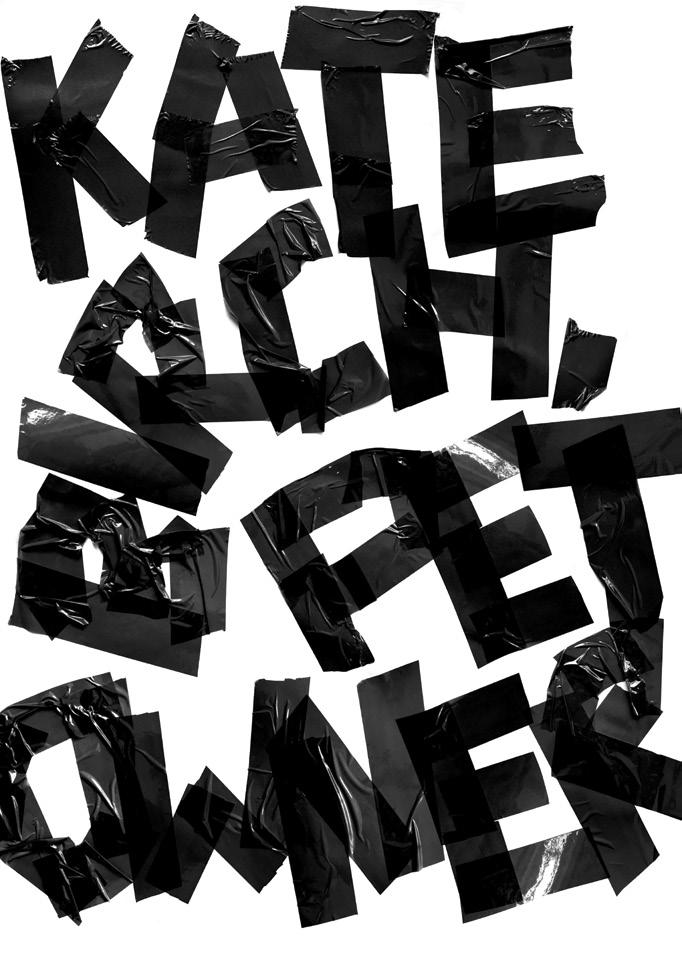

The Neubad Plakat
Editors:
Erich Brechbühl
Fons Hickmann
Lea Hinrichs
Sam Steiner
Sven Lindhorst-Emme
Authors:
Erich Brechbühl
Fons Hickmann
Isabelle Mauchle
Urs Emmenegger
Photographs:
Christian Felber MIGN
Design:
Erich Brechbühl
Sam Steiner
Publishing Direction:
Julia Kahl
Lars Harmsen
Proofreading:
Julia Klose
Translation:
Lies Wolf
Printer: Stober Medien
With the kind support of: Stadt Luzern/FUKA-Fonds
SKDZ Schule für Kunst und Design Zürich
Casimir Eigensatz Stiftung
Slanted Publishers UG (haftungsbeschränkt)
Nördliche Uferstraße 4–6
76189 Karlsruhe
Germany
T +49 (0) 721 85148268 info@slanted.de slanted.de @slanted_publishers
© Slanted Publishers, Karlsruhe, 2023 Nördliche Uferstraße 4–6, 76189 Karlsruhe, Germany
© Posters and texts by the designers/authors
All rights reserved.
ISBN: 978-3-948440-49-7
1st edition 2023
2500 ex.
Disclaimer
The publisher assumes no responsibility for the accuracy of all information. Publisher and editor assume that material that was made available for publishing, is free of third party rights. Reproduction and storage require the per mission of the publisher. Photos and texts are welcome, but there is no liability. Signed contributions do not necessarily represent the opinion of the publisher or the editor.
The German National Library lists this publication in the German National Bibliography; detailed bibliographic data is available on the Internet at dnb.d-nb.de.
Slanted Publishers is an independent publishing and media house founded in 2014 by Lars Harmsen and Julia Kahl. They publish the awardwinning print mag Slanted biannually featuring global design and culture. Since 2004, the daily blog highlights international design and showcases inspiring video interviews. Slanted Publishers initiates and creates publications, focusing on contemporary design and visual culture, working closely with editors and authors to produce outstanding publications with meaningful content and high quality.
978-3-948440-49-7